The Netflix documentary that I chose to watch and analyze is an episode of the series produced by Vox Media called “The Racial Wealth Gap | Explained”.
The major elements present in the show are recurring themes, visual representations, interviews, and repetition. All of these elements are effective building blocks to crafting an impactful story.
In an article by Jasmine Bina, “How To Tell A Story People Will Never Forget”, she explains that one of the rules of telling a memorable story is to “make your claim, then explain it.” This documentary did this within the first 30 seconds of the episode. The narrator showed the audience how racism and slavery was literal representation of wealth in America for hundreds of years, and the overall questions that guides the story: “why is the racial wealth gap between black and white Americans so large and why is it growing even today?” As opposed to simply telling the audience that this is a historical issue today, they used visual animations to effectively illustrate this issue. These animations are signature elements used by Vox Media in all of their Explained episodes. The use of these animations help break down complex ideas into engaging and bite-sized pieces to help keep the audience on track with the story and narrative.
From a narrative standpoint, Vox used the repetition of racism and slavery and its relation to wealth to show how the two very different concepts are actually deeply related in American history.
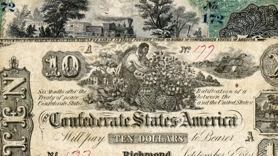

In the beginning of the episode, they bring the audience in by showing what money used to look like during the era of slavery in the U.S. Notice how the imagery consistent throughout all of the bills were that of African slaves working on plantations. This resonated with me when comparing it to how different U.S. currency is today. Back then, slaves didn’t just symbolize wealth, they WERE wealth for white people for hundreds of years. This information was presented in a simple and easy way for the audience to easily make that connection without assuming that they will make this connection later on in the episode. Shortly after, they show how the wealth gap between black and white Americans has changed over time but is actually growing. In the first two minutes, Vox easily showed the audience where the story was beginning, and where it was going to end–addressing the question of the racial wealth gap.
In a short 16-minute documentary, they were able to take the audience through the history of racism; define wealth and how wealth grows; housing discrimination; and why the racial wealth gap will continue to grow and how it is not an issue that can be simply addressed without radical change.
How the filmmakers drew me into the story.
The use of visual elements, interviews with credible sources, and music.
As I previously stated, their use of animations along with documentary photos effectively helped the viewers through the narrative. If the documentary was to solely rely on these elements alone, the story and narrative would have grown tiresome with the audience.
They brought in experts and prominent people to share their experiences and knowledge lending credibility to the story. For instance, they featured clips from an interview with Corey Booker, an African-American congressman from New Jersey. He told the story of how his parents experienced first-hand housing discrimination and racism when they were searching for a home. Their success in becoming homeowners determined the growth of their family wealth and the opportunities that became available to them. Stories such as these added to the overall narrative but also provided brief breaks between the animations and historical photos while again touching on credibility.
Lastly, their use of music to underscore different sections helped set appropriate tone to effectively communicate messages in the story. For example, in the beginning of the episode, the filmmakers chose to use a soft slow-paced piano when they first began talking about the history of slavery in America and its relationship to wealth. This was the right decision because the dark history of slavery is a very serious topic to cover and the music choice was appropriate and helped set a serious tone of what to expect from the episode. Using a brighter, happier tone would have thrown off the delivery and confused the audience.
I am very much a fan of the stylistic choices that Vox’s filmmakers use in producing the “Explained” series. For my future presentations, I plan on using more creative illustrations to help break-down complex ideas for the audience. Instead of using basic charts and graphs, I can bring in photos and infographics to help add to the presentation instead of relying heavily on text. Intentionality in the use of these visual elements will help keep my future audiences engaged throughout the presentation. Moreover, thinking of my presentation as a narrative story and always keeping the audiences perspective in mind as I am creating the presentation will help with positive engagement from the audience as well.
By analyzing how the filmmakers can take complex concepts and ideas and turn them into memorable stories, I can improve the way that I present information. This applies not only to presentations, but also to how I draft effective ad campaigns with the audience in mind.

Leave a comment